IID Website
Everyone who opens an interior design school's website wants to learn how a room should feel. So the home page is the first room they walk into.
IID is an interior design institute, and this is the home page I designed for it. It lives in Figma, so there's no code in this story. Just one frame, 1,280 pixels wide and 10,434 tall.
That's a very long room.
Twelve screens of things to say
The page has a lot to carry: nine courses, four benefits, career paths, life at the institute, reasons to join, student reviews, FAQs, the director, an enrolment form and students' work.
Give all of that the same treatment and you get a wall. Nobody reads a wall. So the hard part wasn't filling the page. It was pace. Each section needed to feel like a new room, while the whole scroll still felt like one building.

Four things set that pace: the type, the colour, the layout and a small kit of parts that keeps coming back.
Two voices
Two typefaces carry the page, and each one has a job.
Plus Jakarta Sans does the announcing. Every section heading is set in it, bold and large, with the letters pulled in tight.1 That makes a heading read as one solid shape instead of a row of letters.
Inter does the reading: the menu, every paragraph, the course names and the FAQ questions. You aren't meant to notice it, and that's its job.
Watch the x-height2 line as the word changes. Inter's lowercase stands taller, at 74% of its capitals against Jakarta's 72%, which helps small paragraphs stay clear.
One blue, two touches of gold
The colour is close to a single idea. One strong blue fills the big sections, the buttons, the icons and the open FAQ row. Headings use a far deeper navy, which reads almost black but stays in the family. Even the pale backgrounds lean blue instead of grey.
On a page this long, colour also keeps time. White gives you room. A pale tint marks a quiet change. Every few screens a full band of blue arrives, and you know you've reached somewhere new. Blue never touches blue.

About a quarter of the page is blue. About 0.02% of it is gold. Gold appears in exactly two places: the laurels around the award line at the top, and the same laurels beside the enrolment form.
So the only warm colour on the page sits next to the two moments that matter most: the first impression and the ask.
Lines from the drawing board
An interior project starts as a drawing, and the page keeps some of that. The hero sits on a line drawing of a room. Thin dashed lines with small dots run down the sides of sections, like the construction lines on a plan. The FAQ rows wear the same dashes as their border.
Under those lines, the layout stays plain. Our Program is the clearest example. Nine courses could have been a long list. Instead they sit in three columns of matching cards, so your eye learns the pattern once and then just reads.
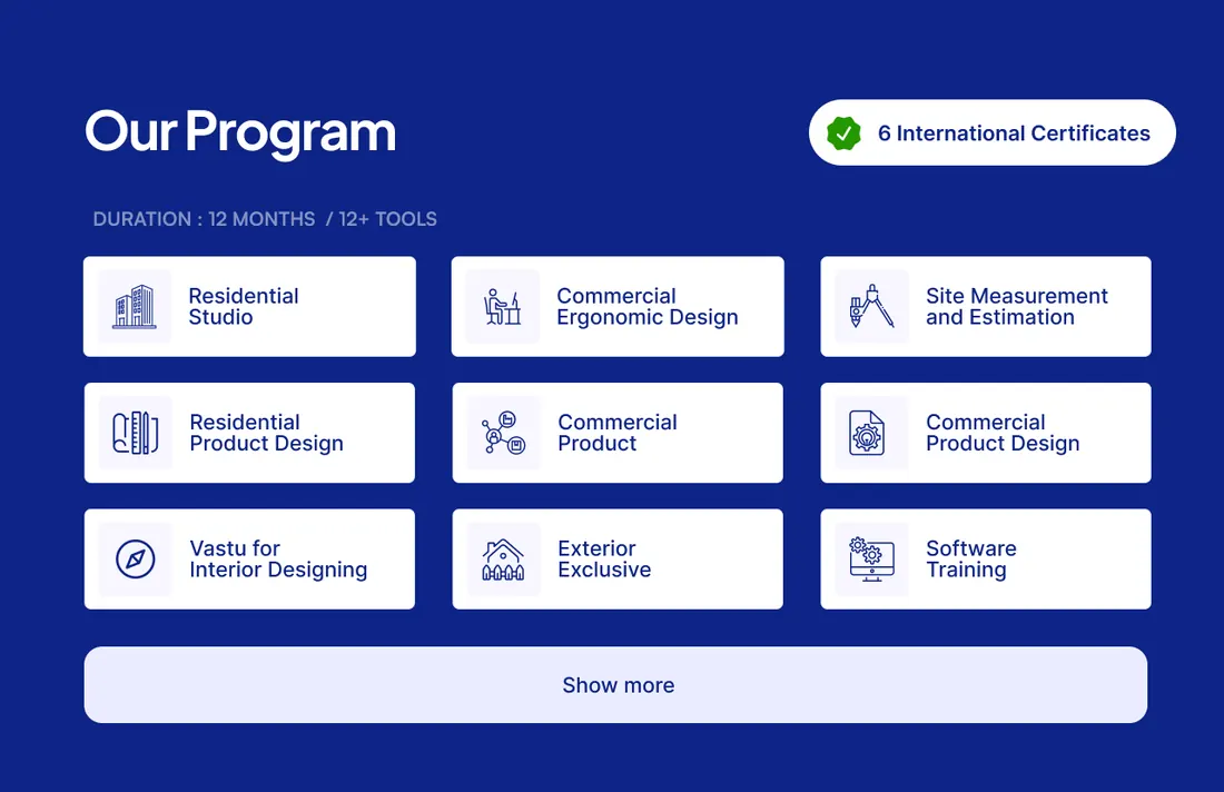
The smaller details follow the same logic. Corners grow with the card: 7 pixels on a course card, 8 on a button, 12 on a benefit tile, 17 on a review and 33 on the big feature cards. And the rows of photos, reviews and career pills run off the page and fade out, so you know there's more without a single arrow.
A small kit of parts
A long page only feels calm if its parts repeat. This one gets by with very few: a white card with a soft edge, a pale square for each icon, and solid blue for whatever is active.
The FAQ shows how that works. Closed rows stay quiet: white, with that dashed edge. Open one and it fills with the page's strongest blue. Only one row holds that colour at a time, so your eye goes straight to the answer you asked for.
Still in Figma
This one lives in Figma, so I have no launch to talk about and no numbers to show you. What I can show is how little a page this long really needs.
 Site Measurement
and EstimationInterior Architect
Two voices, one blue and two touches of gold. All of it is there to decide where you look next, and when you get to rest.
A good room is mostly space, well arranged. So is a good page.